Explorers of the Galaxy

Designing the mission-driven platform used by the Silver-winning team at the EIT Health European Final.

scroll down white icon
time icon

6 min read

Design Thinking workshop transitioning into a remote innovation platform during the COVID-19 pandemic, with a collaborative workspace blending into a digital mission-based interface.

From Physical Space to Digital Structure

The Context

Loss of physical structure, remote cognitive drift

Innovation Day (i-Day) is structured around Design Thinking and traditionally unfolds in physical space. Walls covered in post-its, visible iteration, facilitation cues, and shared energy ground abstract thinking in something tangible.

In 2020, the COVID-19 pandemic eliminated the physical structure that sustained the event.

The remote edition could not rely on proximity or physical artefacts to stabilize abstraction. What had previously been sustained by space now depended entirely on interface.

When physical structure disappears, cognitive drift accelerates. Sustaining focus became the system’s responsibility.

Two event days. Multiple teams. Extended sessions. Remote fatigue.

The platform had to preserve orientation, maintain momentum, and make progression perceptible — without the ambient reinforcement of a shared room.

User flow diagram illustrating the end-to-end learning journey, including onboarding, navigation, mission progression, rewards, planet unlocking, and final collaborative session.

Simplified navigation architecture of the Innovation Day remote platform

Structural Tension

Abstract workflow, no spatial grounding

Design Thinking is inherently abstract. In physical workshops, abstraction is stabilized by movement and collective visibility. Online, it fragments into tabs and detached documents.

The question was architectural:
How do you convert an intangible workflow into a system that feels navigable, progressive, and structured?

The narrative universe had already been partially defined. Core game concepts existed. Development constraints were real, and the timeline was limited to three months.

Architecture had to absorb complexity and produce coherence.

Narrative as Architecture

Mission logic structuring progression

The sci-fi universe was not treated as decoration. It became the organizing logic of the experience.

Each Design Thinking phase translated into a mission. Progression became spatial rather than linear. Advancement was revealed through unlocked nodes, activated paths, and visible structural transformation.

The platform operated through three persistent anchors:
Start — global orientation via the Navigation Chart.
Your Ship — identity and system state.
Missions — execution and progression.

Progress was expressed through structural change. The narrative justified movement. The architecture regulated it.

State-Driven Control

Explicit states enabling progression

The system functioned through explicit states: Locked, Unlocked, Completed.

Nothing advanced implicitly. Completion required confirmation and produced visible consequence.

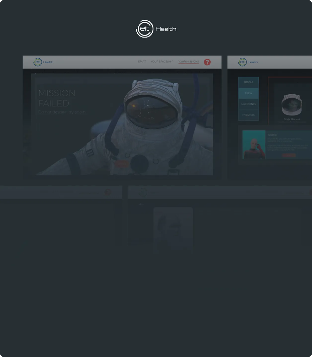
Overlays marked outcome — Mission Failed or Access Granted — reinforcing progression logic. A contextual hint system prevented cognitive dead-ends while preserving challenge. Retry was immediate, containing frustration without flattening engagement.

Clarity reduced fatigue. Progress reduced drift.

Interface System & Motion Hierarchy

Immersion guided by structural clarity

The interface layout was guided by a multi-column grid to maintain alignment, spacing rhythm, and compositional balance across screens. Even under tight timelines, structural alignment remained a constant reference point.

A modular HUD-inspired panel system governed hierarchy and spatial organization. Panels, overlays, mission stacks, and control elements followed repeatable compositional logic rather than isolated visual decisions.

Navigation used semi-transparent white to remain omnipresent without competing against deep spatial backgrounds. Core colors — white (#ffffff), signal red (#d64a4a), and deep teal (#296377) — established hierarchy without assigning moral value to color.

Because red functioned as an activation accent across the system, validation and error were not encoded chromatically. Instead, feedback relied on symbolic reinforcement and narrative cues.

Validation appeared through check iconography and stable astronaut posture. Failure incorporated X iconography and fractured visor imagery. Meaning was conveyed through composition, icon, and motion — not color inversion.

Typography relied on Montserrat for its weight range and geometric neutrality. Expanded uppercase headings reinforced the interplanetary tone, while body text preserved clarity through scale contrast and restrained glow effects.

Motion operated hierarchically. Micro-interactions confirmed input. Overlay transitions marked structural shifts. Cinematic sequences were reserved for narrative thresholds — planet arrivals, milestone confirmations, guided communications — while operational interactions remained predominantly 2D to preserve clarity and performance stability.

To extend the interface into a cohesive universe, Capcom, Dr. Sheldon, and the spacecraft were modeled in Maya. These 3D elements were not decorative inserts but formal extensions of the system. Capcom’s hexagonal suit echoed navigation geometry; red accents aligned with activation states; deep black reinforced spatial continuity. The character functioned as a tactical guide rather than a mascot.

Planetary environments and shockwave sequences were constructed in After Effects through layered compositing and rotating texture simulations. Depth was achieved through controlled parallax and blending modes, balancing immersion with production feasibility.

The experience opened with a cinematic sequence in which Earth collapses into a burning sphere, establishing urgency before any interface interaction occurred. Immersion preceded instruction.

Each planetary transition was introduced through short video sequences that reset attention and reinforced narrative continuity. The journey concluded with an integrated video-based resolution, providing emotional closure and reinforcing collective achievement.

Cinematic framing structured engagement across the full lifecycle of the experience.

All UI assets were designed in Adobe Illustrator to align with the development team’s workflow, ensuring predictable export and implementation.

The result was a visually immersive yet structurally disciplined system — sustaining engagement while preserving operational clarity.

Managing Complexity

Reducing noise to preserve coherence

Early iterations introduced additional mechanics: energy layers, time indicators, denser environmental backgrounds. While they increased thematic richness, they diluted structural clarity.The interface layout was guided by a multi-column grid to maintain alignment, spacing rhythm, and compositional balance across screens. Even under tight timelines, structural alignment remained a constant reference point.

They were removed.

Wing-like graphic elements were also eliminated after evaluating interpretive neutrality. The system evolved from concept-heavy to architecture-led — not through minimalism, but through prioritization.

Interaction as Reinforcement

Mechanics validating understanding

Mechanics functioned as validation layers embedded in progression.

The Quantum Sublimator evolved from decorative object into a spatial reasoning tool. Drag-and-drop positioning validated logic. Immediate feedback reinforced state transitions.

The Unlocking Wheel required sequential recognition. Errors remained contained; retry preserved flow.

Symbolic puzzles — including matrix-based Sudoku and cuboid decryption — embedded cognitive demand into narrative continuity. Engagement remained structured, not ornamental.

Testing & Validation

External feedback informing refinement

Testing was iterative and externally conducted. Stakeholders ran multiple remote test rounds prior to launch and shared structured feedback that informed refinements to progression logic, narrative clarity, and system stability.

The platform went live without structural usability breakdowns. In a live remote setting, robustness was the primary metric.

Outcomes

Performance at scale

The platform supported 100–120 participants across two event days. Teams advanced without structural collapse, and progression remained continuously visible.

The architecture later proved transferable and was adopted by other EIT Health nodes.

The Universitat de Barcelona team Parolu secured the Silver Prize at the European final. While the platform was one of several contributing factors, it successfully supported a team competing at European level.

Architecture does not win awards. It enables performance.

Reflection

Clarity under abstraction

This project clarified a structural principle:
When abstraction increases, architecture must compensate.

What worked:
→ Layered progression logic
→ Persistent state visibility
→ Controlled narrative immersion
→ Simplification through removal

What evolved in my practice:
Since then, I validate architecture through simplified user flow diagrams before UI production. Even when UI screens are treated as temporary, producing them too early slows structural iteration.

Structure sustains attention.
Clarity sustains performance.