Protect the Teddies

Designing a gamified compliance system for TOUS’s national workforce

scroll down white icon
time icon

8 min read

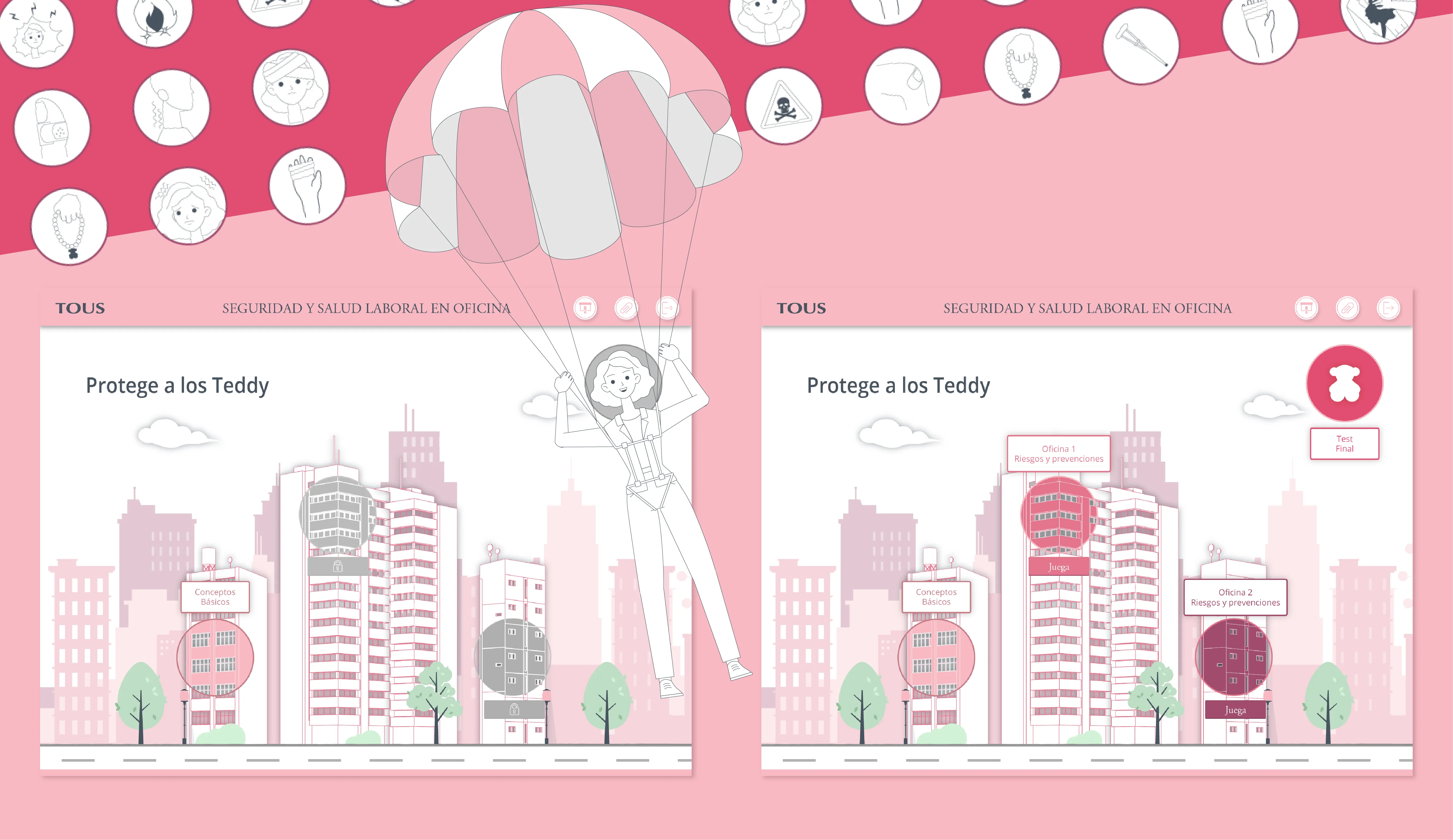
Two pink cityscape illustrations titled 'Protege a los Teddy' with a parachuting woman in the center.

"Protect the Teddies" home screen

The Context

Passive Compliance at Scale

TOUS required role-specific Occupational Health & Safety training for more than 1,500 employees across Spain — warehouse, office, and retail environments. Each employee completed only the course relevant to their role. The content differed. The system could not.

The real risk was not failure.
It was passive completion.

The objective was clear: translate legal compliance into a system that required attention, validated understanding through a 19-question assessment, and remained measurable via LMS reporting.

Constraints were structural: legal rigor, unambiguous risk representation, tight production timeline, and layered interaction patterns.

Before this intervention, OHS training relied on static PDF documentation and internal video materials. Information was comprehensive, procedures were explained, and risk categories were clearly listed. The format, however, was linear.

Comprehension depended on passive consumption. There was no interaction layer, no visible state feedback, and no measurable trace of recognition before the final assessment. Understanding was assumed rather than structurally verified.

Structural Tension

When Brand Conflicts with Safety

The experience followed a controlled progression:
Conceptual grounding → Exploration → Reinforcement → Verification.

But an early tension reframed the project.

TOUS provided a well-defined visual identity, including character proportions aligned with brand language.

In theory, alignment simplifies decisions.

In practice, it can introduce friction.

The question became more precise:
What happens when a consolidated brand system does not fully support functional clarity?

In static compositions, the proportions worked.
In ergonomic risk simulation, they did not.

Posture, strain, and imbalance depend on anatomical clarity.

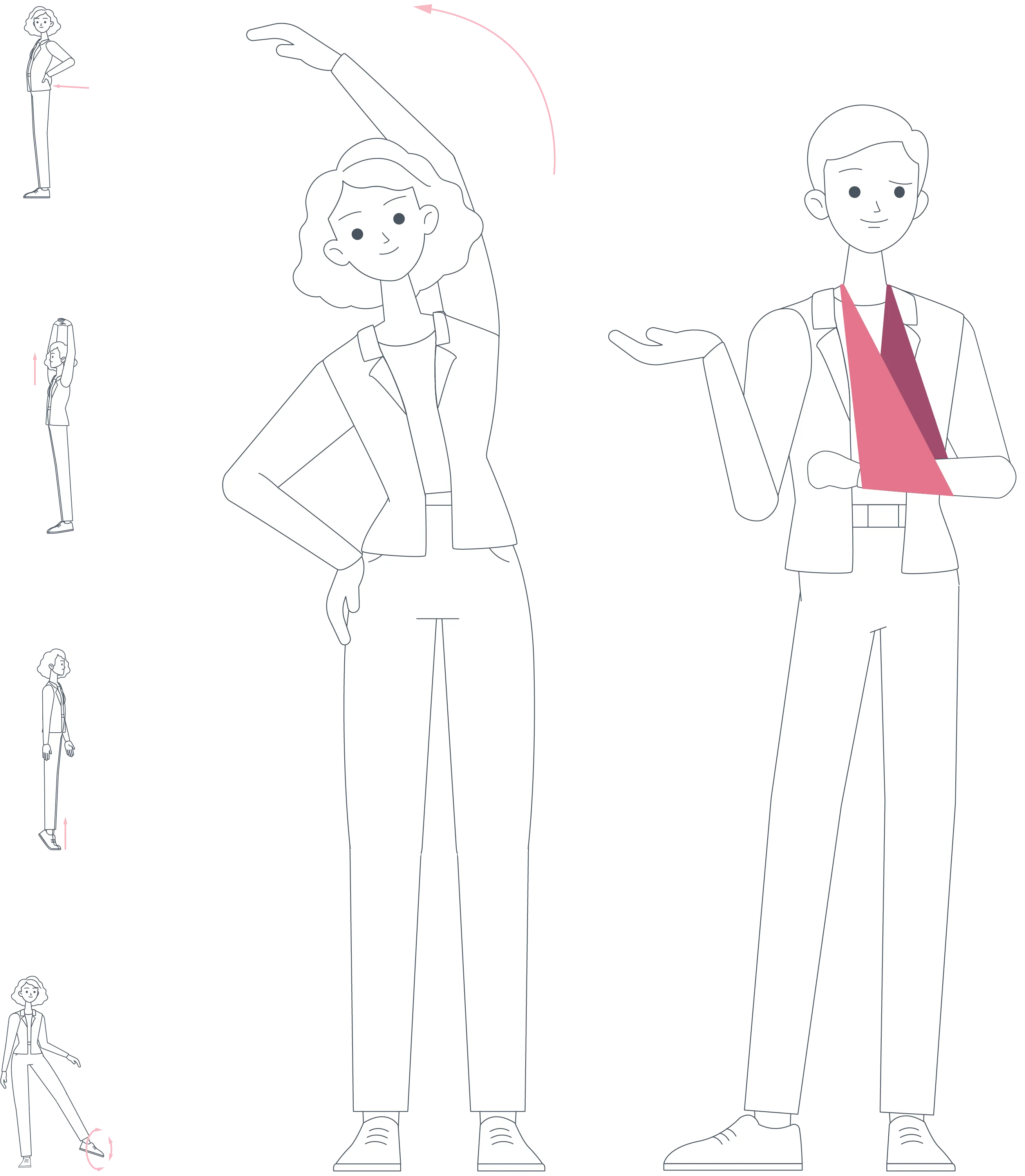
Compressed ‘chibi’ limbs reduced legibility.

The decision became structural:
Preserve stylistic fidelity, or prioritize risk recognition?

We transitioned to slightly stylized proportions to improve anatomical clarity.

The change was visible — and necessary.

From that point forward, one principle governed the system:
If it affects understanding, it affects safety.

Line art of a man standing and a woman stretching her arm over her head.

Original character proportions

Line art of woman stretching one arm overhead and man with arm in a sling standing side by side.

New character proportions

System Architecture

State-Driven Learning System

Each module—warehouse, office, and retail—operated as a modular learning canvas. The scenario changed. The interface did not.

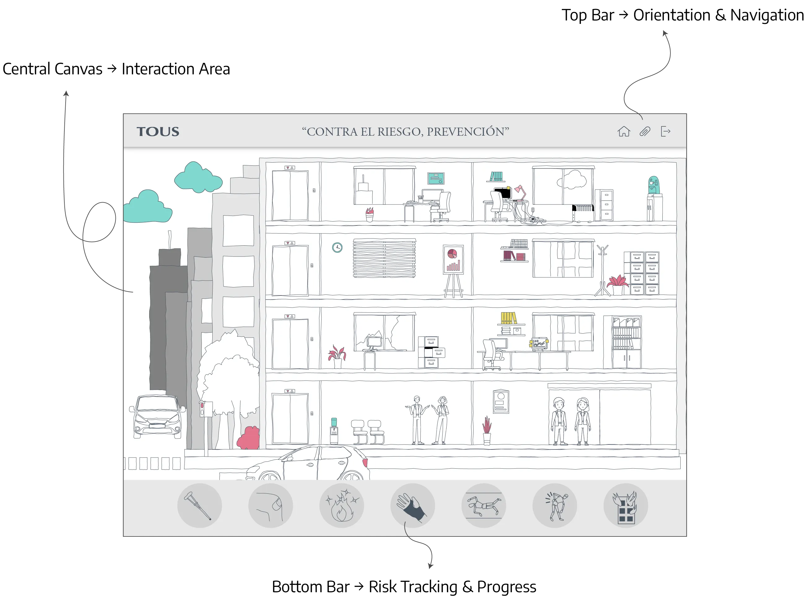
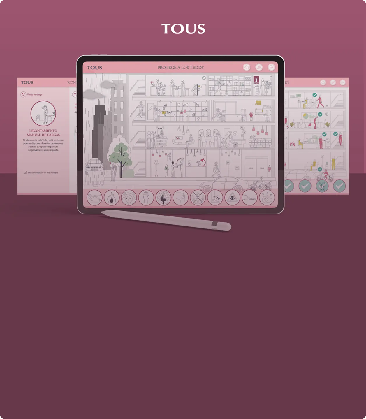
A persistent three-layer architecture structured every screen:
Top Bar → orientation and navigation
Central Canvas → interaction area
Bottom Bar → risk tracking and learning progress

This consistent spatial hierarchy prevented cognitive reset and allowed attention to remain on hazard recognition rather than interface navigation.

Visual density was deliberately controlled. Line-based characters over white backgrounds reduced visual noise, allowing meaning to emerge through interaction rather than decoration.

Illustration of a multi-story office building with people, furniture, and labeled UI bars around it.

Mid-fidelity wireframe

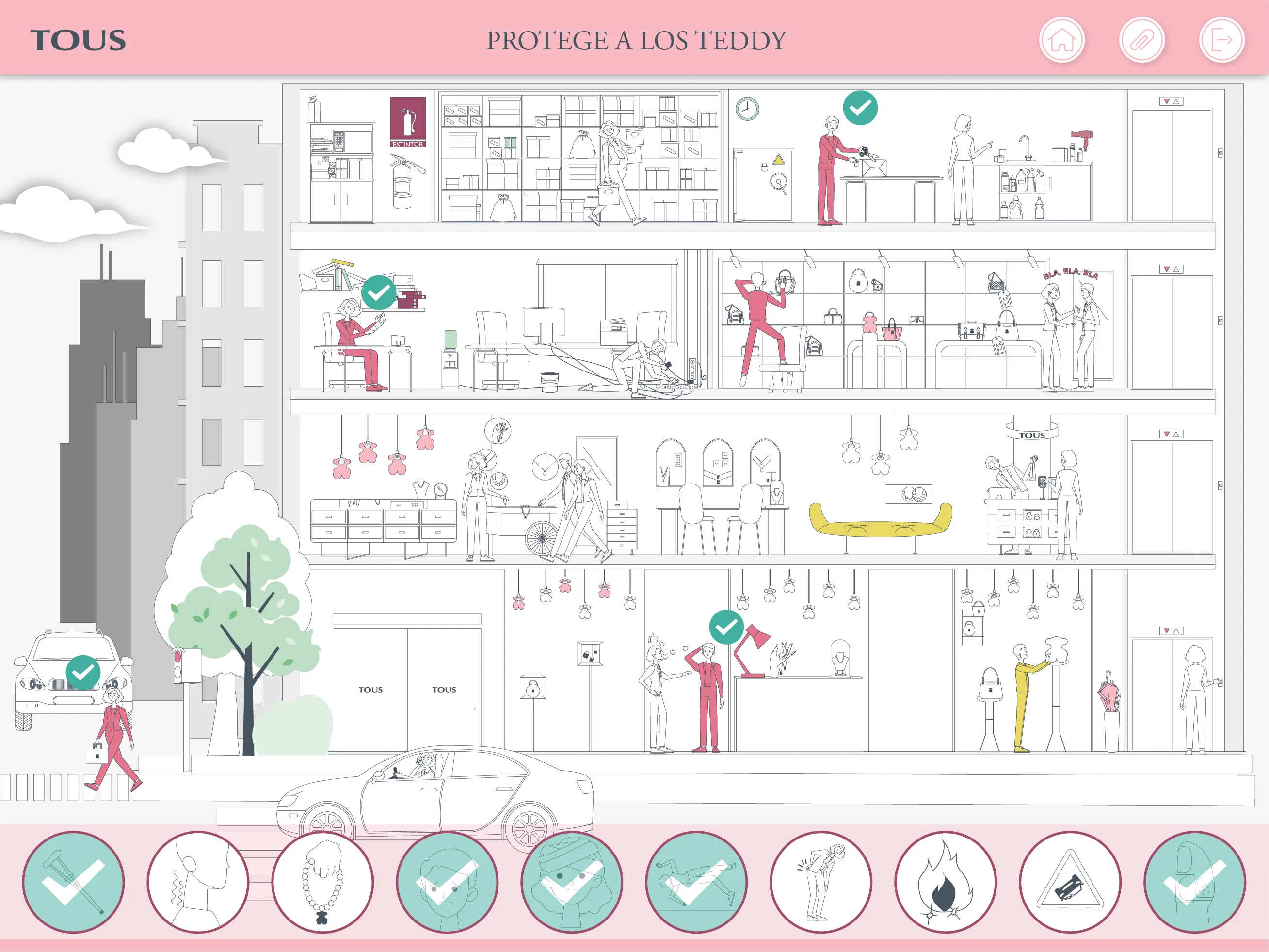
Illustration of a multi-floor store showing employees practicing safety measures with teal checkmarks.

High-fidelity wireframe

System Architecture

Semantic Communication System

Semantic Color System

The interface relied on a semantic color system in which every color represented a distinct learning state rather than decoration.

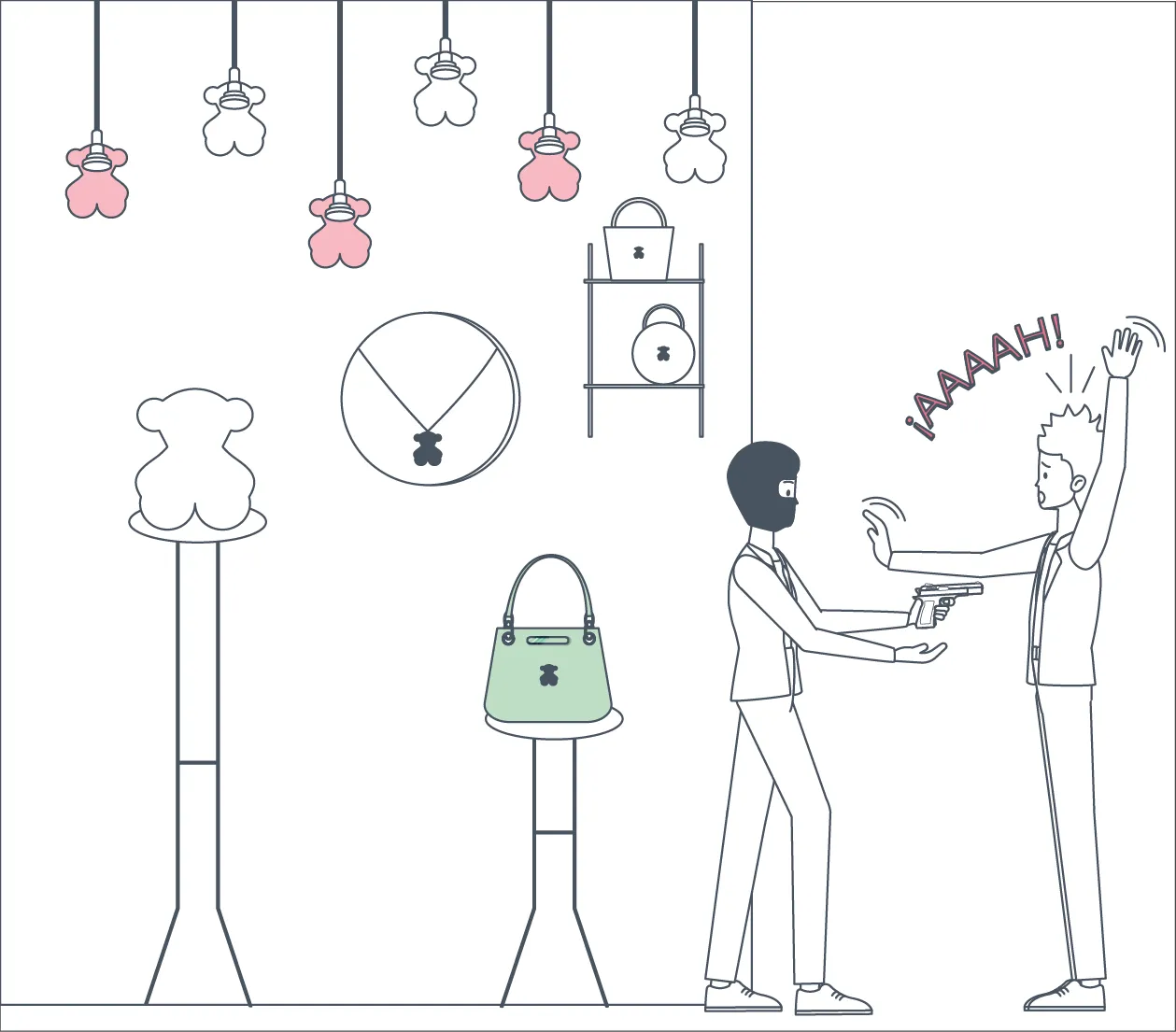
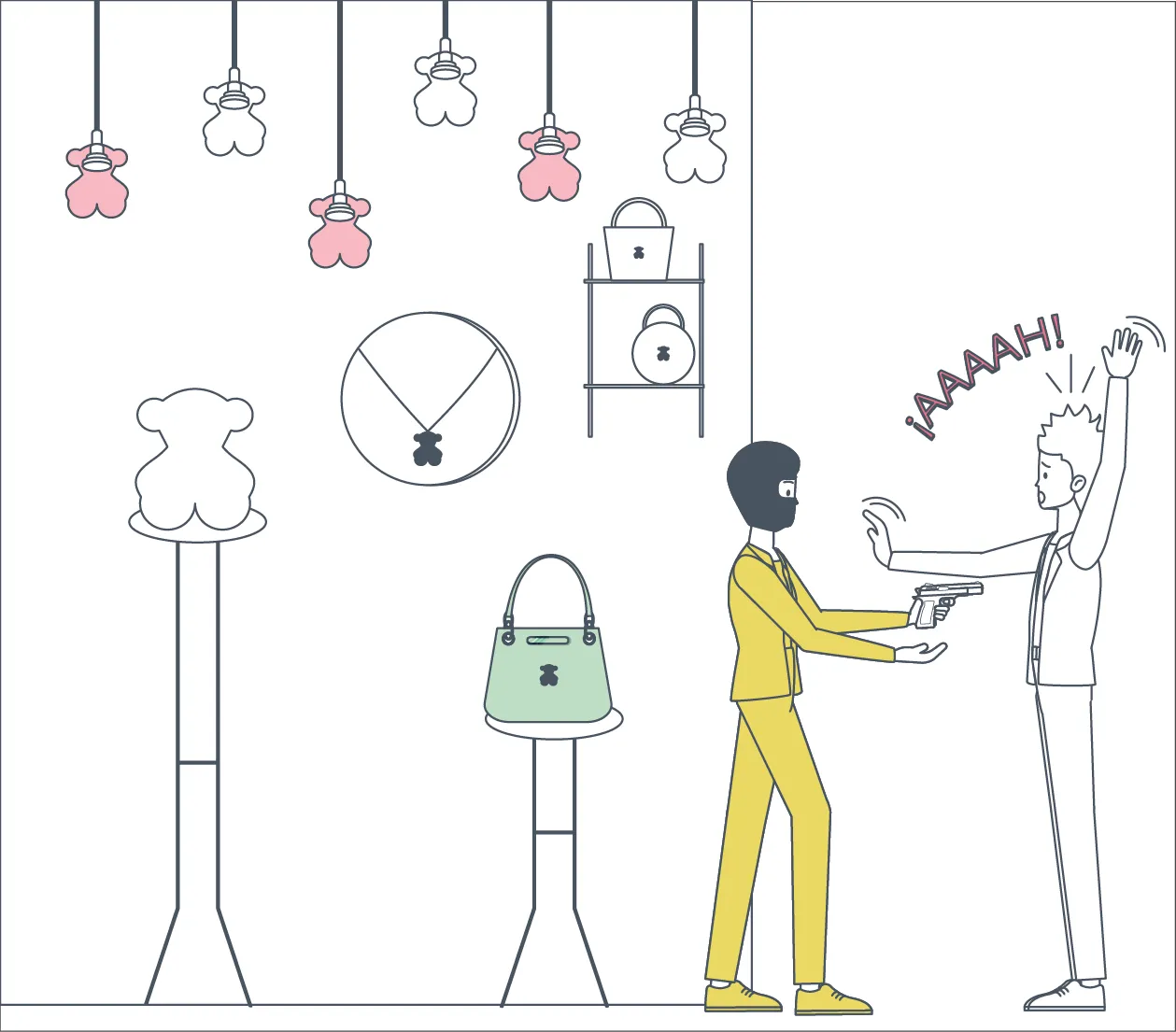
The primary hazard-identification experience operated through four persistent states:
Default White — Default State → not yet evaluated
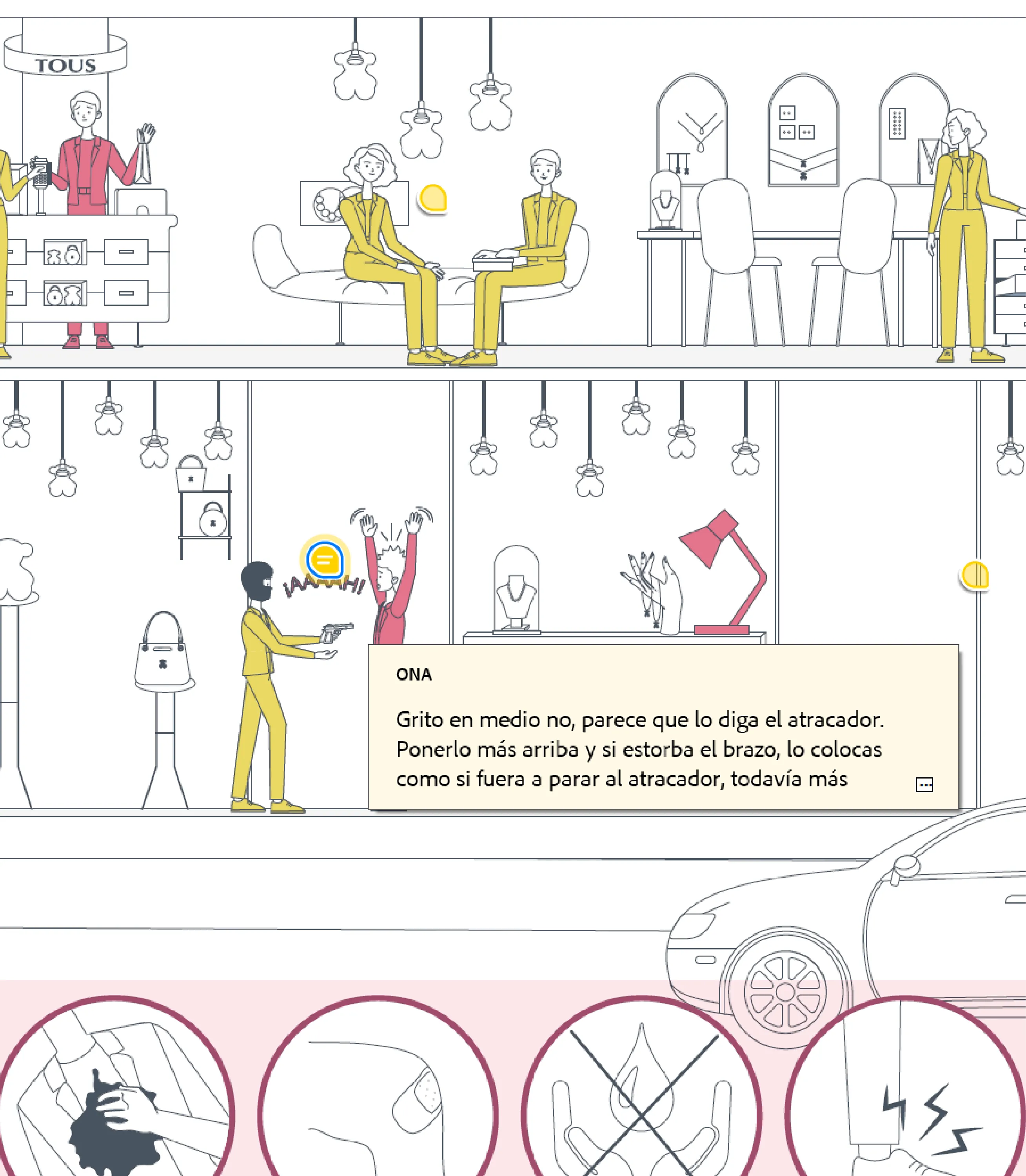
Safety Yellow — Safe State → evaluated, no hazard detected
Risk Pink — Risk State → hazard identified
Validation Teal — Validation State → correct identification confirmed

Risk and validation were intentionally separated.

Risk Pink communicated that a hazardous situation existed.
Validation Teal confirmed that the learner had correctly identified it.
Safety Yellow clarified that an element had been evaluated but did not represent an occupational hazard.

Across supporting learning activities, two additional semantic states were introduced:
Story Plum — Information State → contextual explanations, prevention guidance, and instructional content
Alert Coral — Error State → incorrect responses during concept-based exercises

Multimodal Feedback

Color was never used as the only communication channel.

Every learning state was reinforced through multiple feedback layers:
→ semantic color
→ iconography
→ motion
→ persistent state changes

Correct selections triggered a rollover animation that amplified unsafe posture, making strain, imbalance, and ergonomic risk more legible than in the static illustration. Motion clarified consequence rather than adding decoration.

Risk recognition was always reinforced through:
→ visual state changes
→ bottom-bar icon activation
→ hazard category mapping
→ cumulative progress tracking

The bottom bar simultaneously functioned as:
→ progress indicator
→ cognitive map
→ memory scaffold

Learners always knew:
→ how many hazards existed
→ how many had already been identified
→ which prevention category each belonged to

Accessibility by Design

Accessibility was considered as part of the interaction system rather than as a visual afterthought.

Semantic states were validated against Protanopia, Deuteranopia, and Tritanopia simulations, while contrast ratios met WCAG AA standards.

Because meaning was communicated through multiple channels—not color alone—critical safety information remained understandable regardless of color perception.

Exploration remained open-order.
Progress depended on recognition.

The interface did not reward clicking.
It required noticing.

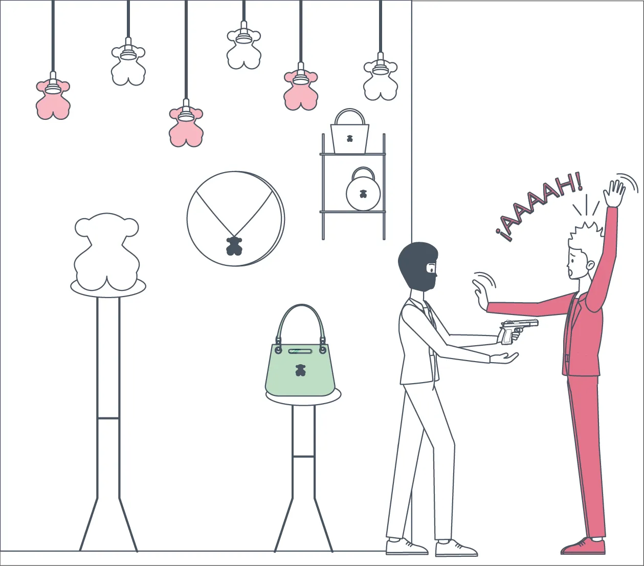
A man points a gun at a raising-hands man in a Tous' shop

Default White — Default State

A man in yellow suit points a gun at a raising-hands man in a Tous' shop

Safety Yellow — Safe State

A man points a gun at a raising-hands man in pink suit in a Tous' shop.

Risk Pink — Risk State

A man points a gun at a raising-hands man in pink suit in a Tous' shop.

Validation Teal — Validation State

Text showing font examples, color contrast ratio 5.56:1, and color palette meeting WCAG AA standards.

Accessibility Validation

Three button states labeled Cerrar with card icons below labeled Default, Hover, and Disabled.

Interactive Components

Color Palette

Semantic Color Tokens

Interaction Model

Recognition Before Verification

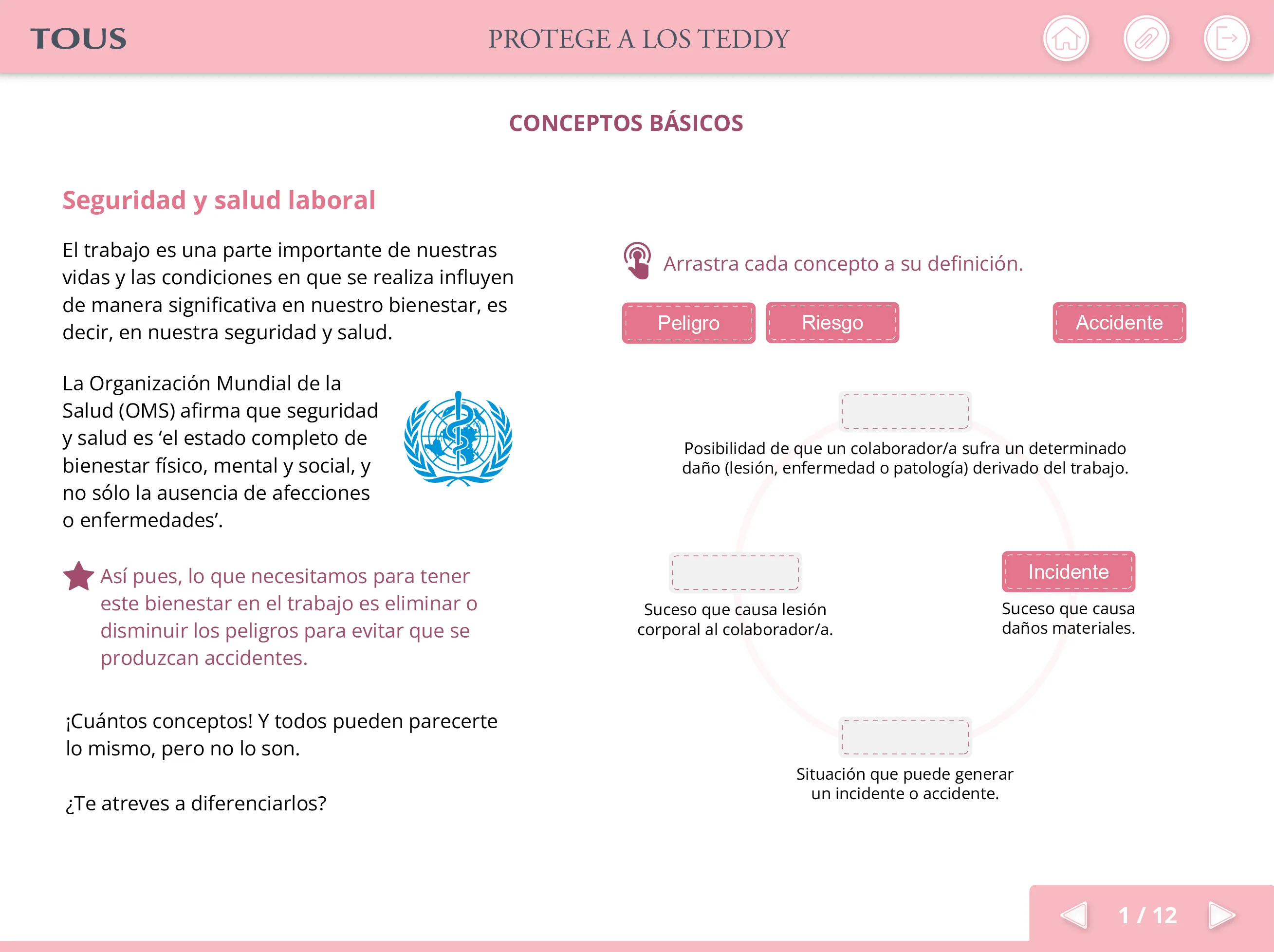
Foundational prevention concepts—legal obligations, signage systems, and first-aid protocols—were introduced through lightweight interactions such as drag & drop, selection tasks, and expandable content.

Learning preceded exploration.

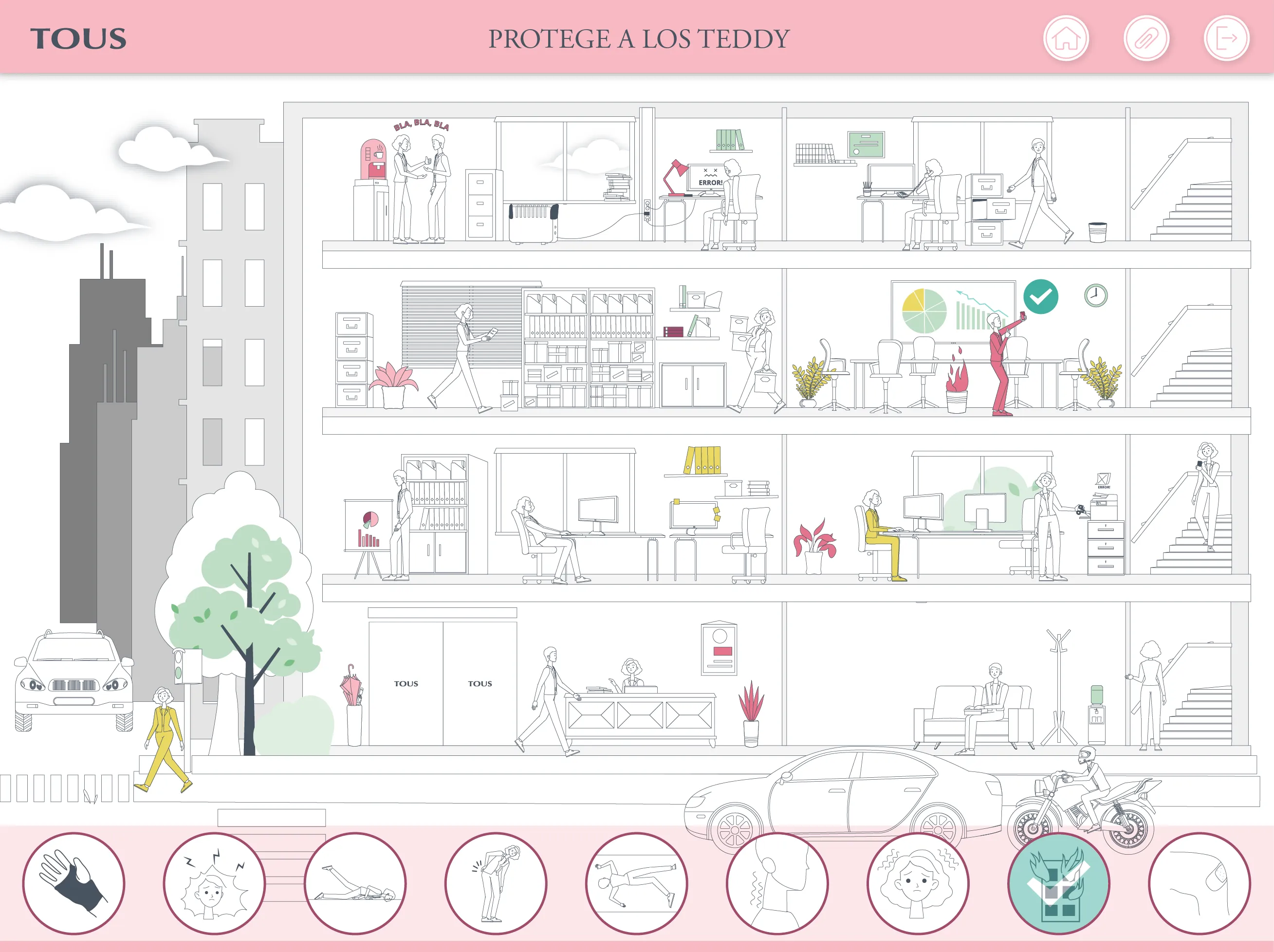
Once users entered the interactive environment, they freely explored each scenario in search of occupational hazards.

Understanding deepened only after a risk had been correctly identified in context.

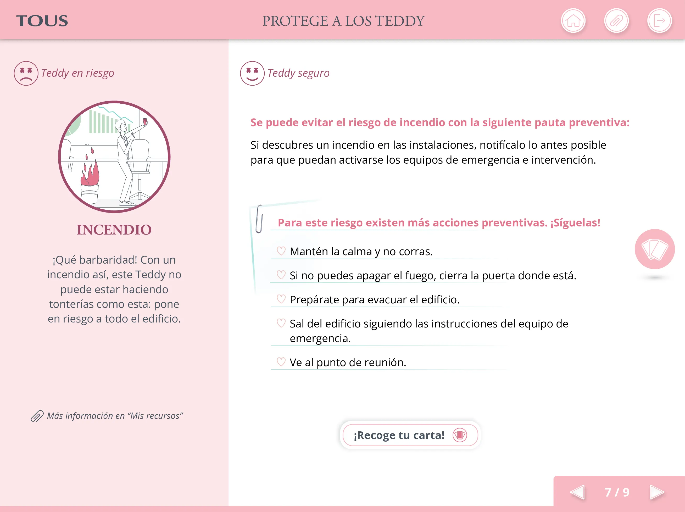
Correct identification unlocked a contextual explanation together with its corresponding Carta de Prevención, transforming recognition into actionable knowledge.

Learn → Explore → Understand → Reinforce

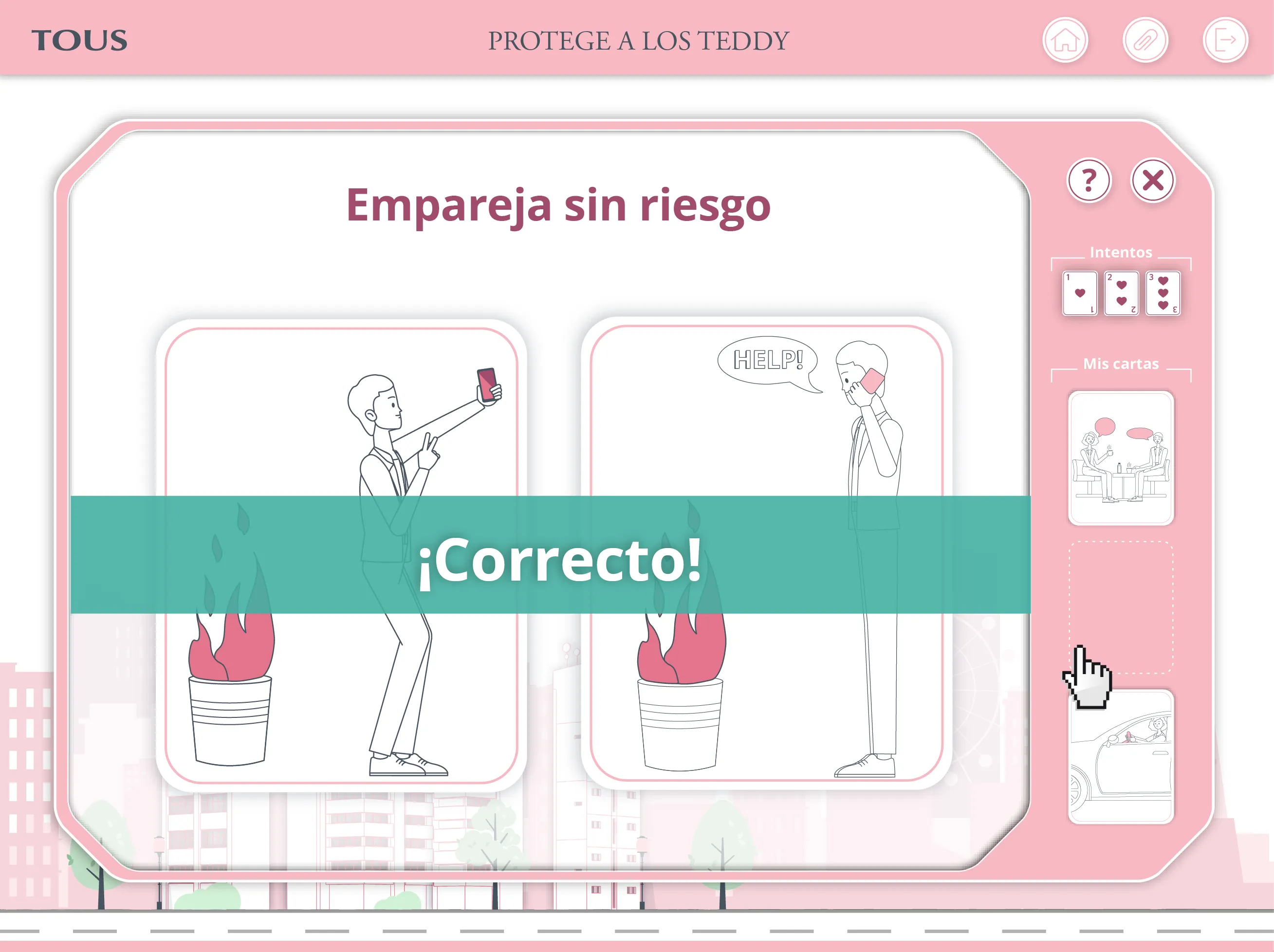
The reinforcement card game extended this learning loop. Each collected prevention card became part of the player's deck, enabling new rounds where risk scenarios were matched with preventive actions. Immediate feedback and a visible life count reinforced understanding without relying on punishment.

Error informed. It did not punish.

Across modules, affordances remained explicit:
Hover suggested activation.
Color confirmed consequence.
Iconography categorized risk.

The interface taught itself once and reused its logic consistently.

Assets were designed for multi-scale implementation within a game engine environment, ensuring technical scalability without compromising legibility.

Interaction flows were prototyped in Figma to validate state transitions and navigation logic before asset production. Final vector assets were produced in Illustrator to align with the development pipeline and ensure clean implementation in the game engine.

Interactive drag-and-drop exercise introducing core occupational health and safety concepts before workplace risk exploration.

Learn - Foundational Concepts

Interactive office scenario where learners identify workplace hazards within a detailed environment before receiving preventive guidance.

Recognize - Risk Exploration

Risk explanation screen showing the identified hazard, preventive recommendations, and the prevention card unlocked after correct recognition.

Understand - Contextual Prevention

Memory card game reinforcing previously learned prevention measures through immediate feedback and collected prevention cards.

Reinforce - Card-Based Practice

Collaborative Validation

Clarity Tested Against Reality

Iteration was not aesthetic polishing.
It was collaborative validation.

The prototype was reviewed continuously by the instructional lead and the client’s prevention experts. Feedback came from two perspectives: regulatory precision and operational realism.

Adjustments focused on clarity at multiple levels:

Anatomical precision

Posture angles were refined to ensure strain and imbalance were unmistakable. Instructional feedback confirmed that these refinements reduced ambiguity in risk interpretation compared to prior document-based materials.

Contextual realism

High-visibility vests were added in warehouse scenarios to reflect real logistics conditions.

Textual clarity

Interface microcopy was tightened to eliminate legal ambiguity and reduce cognitive friction.One late insight reshaped future practice: stroke weight significantly impacts legibility across users and devices.

While accessibility was considered from the prototype stage, this refinement reinforced that even minor visual variables demand explicit validation at scale.

Screenshot of a Figma prototype annotated by the instructional lead with implementation feedback. Comments refine illustration clarity, positioning, and visual interpretation to improve regulatory accuracy and reduce ambiguity.

Expert review

Selection of safety scenario cards reviewed by a user during prototype testing. Feedback focuses on visual hierarchy and object prominence, improving comprehension by adjusting illustration details and reducing unnecessary visual distraction.

User validation

Outcome

From Passive Consumption to Verified Understanding

More than 1,500 employees completed role-specific training built on this system.

A single interaction framework supported learning across office, retail and warehouse environments while preserving consistent navigation, feedback and instructional patterns.

Knowledge was verified through a timed assessment and measurable via LMS reporting.

Legal compliance was translated into a state-driven interaction system.

Interactive office safety environment illustrating ergonomic, electrical and emergency risks through a reusable visual system adapted to administrative workspaces.

Office

Interactive retail safety environment featuring customer-facing scenarios such as robbery prevention, emergency procedures and shop-floor hazards using the same interaction model.

Retail

Interactive warehouse safety environment showing logistics-specific hazards, including forklifts, manual handling, storage systems and fire prevention, built on the same visual learning framework.

Warehouse

Reflection

Legibility Over Identity

What worked: state clarity, consistent feedback architecture, anatomical precision.

Practice evolved through continuous validation and lightweight usability checks before full asset production. Even minor visual variables — such as stroke weight — proved that small decisions scale when repeated across a system.

This project clarified something fundamental: in safety-critical environments, brand language cannot override functional legibility. Visual identity must adapt when clarity becomes a matter of risk.